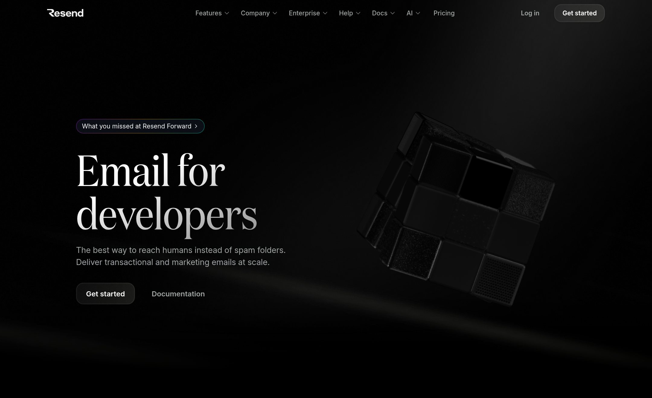
Vektor — [RSZ+PDP+21D+RNO]
Compiled specification ready for Claude Code, Cursor, Codex, Lovable, or v0
# DESIGN.md — 5-Layer Agentic Web Format Specification [RSZ+PDP+21D+RNO]
> Synthesized via **forma.to** for **Vektor**
> Reference DNA: resiz.es (https://resiz.es) · darkmodedesign.com (https://www.darkmodedesign.com) · pdepablo.com (https://pdepablo.com) · minimal.gallery (https://minimal.gallery) · 21st.dev (https://21st.dev) · raycast.com (https://raycast.com) · emilkowal.ski (https://emilkowal.ski) · rauno.me (https://rauno.me) · DarkModeDesign × Resiz.es (https://www.darkmodedesign.com) · unslop-ui (https://github.com/felipebasurto/unslop-ui)

## 1. Project Context & Mission
- **Brand / Product Name:** Vektor
- **Product Brief:** Conversational Kubernetes & FinOps cloud infrastructure platform, dark halftone like resiz.es with minimalist Swiss dock
- **Target Tech Stack:** Next.js (App Router, TypeScript) + Tailwind CSS v4 (`@theme` mapped to CSS custom properties above). Server Components by default; client islands for interactive primitives.
- **5-Layer Composition:**
  1. **Surface & Palette:** *Dark Halftone Infrastructure* (`dark` · `#101010`)
  2. **Typography & Scale:** *Dark Halftone Infrastructure* (`'Geist', 'Inter', sans-serif`)
  3. **Layout & Navigation:** *Swiss Creative Studio & Dock* (`bottom-dock` · `1320px`)
  4. **UI Primitives:** *Design-Engineer Zinc Bento*
  5. **Motion & Animation Physics:** *Invisible Interface & Tactile Lab* (`cubic-bezier(0.32, 0.72, 0, 1)` — iOS sheet deceleration & interruptible springs)

---

## 2. Exact Design Tokens (CSS Custom Properties)
```css
/* Generated by forma.to — 5-Layer Composed Genome [RSZ+PDP+21D+RNO] for Vektor */
@import url('https://fonts.googleapis.com/css2?family=Geist:wght@400;500;600&family=Instrument+Serif:ital@1&family=JetBrains+Mono:wght@400;500&display=swap');

:root {
  /* Layer 01: Color Science & 60-30-10 Role System (Obsidian Carbon & Pure Chalk (OLED High-Contrast · DarkModeDesign × Resiz.es)) */
  /* Verified Contrast: Body 17.7:1 · Primary CTA 19:1 */
  --bg: #101010;               /* 60% Canvas — oklch(17.3% 0.000 0) */
  --surface: #181818;     /* Elevated Cards */
  --panel: #202020;         /* Secondary Wells */
  --ink: #f5f7f5;             /* 30% Primary Ink — oklch(97.4% 0.003 0) */
  --muted: #9ca09d;         /* Supporting Copy */
  --line: rgba(245, 247, 245, 0.10);           /* Hairline Borders */
  --accent: #ffffff;       /* 10% Focal CTA — oklch(100.0% 0.000 0) */
  --accent-ink: #101010;
  --badge-bg: #252525;
  --radius-card: 18px;
  --radius-pill: 9999px;
  --shadow-card: 0 0 0 1px rgba(255,255,255,0.08), 0 20px 50px rgba(0,0,0,0.55);

  /* Layer 02: Typography (Dark Halftone Infrastructure) */
  --font-display: 'Geist', 'Inter', sans-serif;
  --font-sans: 'Geist', 'Inter', sans-serif;
  --font-mono: 'JetBrains Mono', 'DM Mono', monospace;
  --font-serif-accent: 'Instrument Serif', 'Redaction 35', Georgia, serif;
  --h1-size: clamp(2.75rem, 5.6vw, 4.75rem);
  --h1-tracking: -0.035em;
  --body-leading: 1.6;

  /* Layer 03: Spatial Rail (Swiss Creative Studio & Dock) */
  --container-max: 1320px;

  /* Layer 05: Motion Physics (Invisible Interface & Tactile Lab) */
  --ease-out-craft: cubic-bezier(0.32, 0.72, 0, 1);
}

body {
  background-color: var(--bg);
  color: var(--ink);
  font-family: var(--font-sans);
  font-size-adjust: from-font; /* Zero-CLS fallback metric normalization */
  line-height: var(--body-leading);
  -webkit-font-smoothing: antialiased;
}

h1, h2, h3 {
  font-size-adjust: from-font;
  text-wrap: balance;
}

.hero-canvas {
  background-image: radial-gradient(rgba(255,255,255,0.14) 1px, transparent 1px);
  background-size: 14px 14px;
}

.interactive-el {
  transition: transform 160ms var(--ease-out-craft), opacity 160ms var(--ease-out-craft), border-color 160ms ease;
}

@media (prefers-reduced-motion: reduce) {
  *, *::before, *::after {
    animation-duration: 0.01ms !important;
    transition-duration: 0.01ms !important;
  }
}
```

### Surface & 60-30-10 Color Harmony Rules (Happy Hues / Radix / OKLCH)
- **60% Neutral Canvas (`--bg` / `--surface`):** Keep 60%+ of viewport area in calm neutral surfaces (`#101010` / `oklch(17.3% 0.000 0)`).
- **30% Typographic Ink & Hairlines (`--ink` / `--line`):** Verified WCAG contrast **17.7:1** (`#f5f7f5` on `#101010`).
- **10% Focal Chromatic Accent (`--accent`):** Reserve `#ffffff` (`oklch(100.0% 0.000 0)`, CTA contrast **19:1**) strictly for primary CTAs, active indicators, and key focal states — NEVER flood large section backgrounds with accent color.
- **Safe Tint Mixing (`oklab`):** Prefer predefined surface tokens; when mixing tints dynamically with `color-mix()`, mix `in oklab` (never `in oklch` on low-chroma neutrals, which triggers a pink `0deg` hue shift in Chromium).
- **Color Psychology:** Zero-glare stepped dark luminance (#101010 → #181818) for cloud, K8s & security.
- Build depth strictly with luminance steps (`#111111` -> `#181818` -> `#1f1f1f`) and `1px solid rgba(255,255,255,0.10)` borders — ZERO neon glows.
- Use a radial halftone dot matrix behind hero and bottom conversion card.

---

## 3. Typography & Hierarchy (Dark Halftone Infrastructure)
- **Display Font:** `'Geist', 'Inter', sans-serif` | Size: `clamp(2.75rem, 5.6vw, 4.75rem)` | Tracking: `-0.035em`
- **Body Font:** `'Geist', 'Inter', sans-serif` | Line-height: `1.6`
- **Monospace Font:** `'JetBrains Mono', 'DM Mono', monospace`
- **Editorial Serif Accent:** Highlight **one** pivotal word in Hero H1 using `'Instrument Serif', 'Redaction 35', Georgia, serif` italic.
- Set the pivotal word of the H1 in italic serif (`font-weight: 400`) to inject human warmth into deep dark mode.

---

## 4. Layout, Navigation & Section Blueprint (Swiss Creative Studio & Dock)
- **Max Container Width:** `1320px` | **Navigation:** `bottom-dock`
- **Grid Pattern:** Top-left identity pill + Bottom-centered frosted floating dock + Asymmetric 2-col visual grid + Hairline 10-row principles list.

### Top-to-Bottom Page Sequence
1. Top-left minimal `#f2f2f2` identity pill + Bottom fixed frosted-glass dock (`Work`, `Principles`, circular dark contact CTA).
2. Generous whitespace intro with 2-sentence thesis on humanizing technology.
3. Asymmetric 2-column full-bleed rounded media grid (`20px` radius) without cluttered captions.
4. 'How we work' 10 numbered hairline-divided rows.
5. Scarcity availability CTA (`1 spot left` pill) & live clock footer.

---

## 4B. Deterministic Structural CSS & HTML/JSX Skeletons (MANDATORY SCAFFOLD)
> **CRITICAL DIRECTIVE FOR THE CODING AGENT:** Do **NOT** improvise generic SaaS section wrappers, centered gradient blobs, or 3-equal-column icon grids. Use the **6 concrete CSS + TSX structural skeletons** below as your literal DOM & CSS Grid scaffold, replacing only domain copy and mounting interactive logic inside the designated slots.

### Skeleton 01 — Swiss Floating Bottom Dock + Minimal Top Brand (`bottom-dock`)
- **Anti-Slop Guarantee:** Replaces bloated 8-link SaaS headers with an airy top wordmark and a tactile bottom pill dock (< 56px height).

```css
.forma-top-brand {
  max-inline-size: 1320px;
  margin-inline: auto;
  padding: 1.25rem 1.5rem;
  display: flex;
  align-items: center;
  justify-content: space-between;
}
.forma-bottom-dock {
  position: fixed;
  inset-block-end: 1.25rem;
  inset-inline: 0;
  margin-inline: auto;
  inline-size: fit-content;
  max-inline-size: calc(100dvw - 2rem);
  z-index: 40;
  display: flex;
  align-items: center;
  gap: 0.25rem;
  padding: 0.375rem;
  border-radius: var(--radius-pill);
  background: color-mix(in oklch, var(--surface) 86%, transparent);
  backdrop-filter: blur(14px);
  border: 1px solid var(--line);
  box-shadow: var(--shadow-card);
}
.forma-bottom-dock a[aria-current="page"] {
  background: var(--ink);
  color: var(--bg);
}
```

```tsx
<header className="forma-top-brand">
  <a href="/" className="forma-wordmark">Vektor</a>
  <span className="forma-status-mono">v2.4 · ONLINE</span>
</header>

<nav className="forma-bottom-dock" aria-label="Primary">
  <a href="#work" aria-current="page" className="dock-item">Overview</a>
  <a href="#architecture" className="dock-item">Architecture</a>
  <a href="#pricing" className="dock-item">Pricing</a>
  <a href="#start" className="dock-cta">Start free</a>
</nav>
```

### Skeleton 02 — Asymmetric 5/7 Split Hero + Hardware-Framed Stage (`swiss-statement-grid`)
- **Anti-Slop Guarantee:** Eliminates generic centered SaaS gradient blobs in favor of a disciplined 5fr/7fr editorial split and an intrinsic aspect-ratio product stage (zero CLS).

```css
.forma-hero-split {
  max-inline-size: 1320px;
  margin-inline: auto;
  padding: clamp(3.5rem, 7vw, 6.5rem) 1.25rem;
  display: grid;
  grid-template-columns: repeat(12, minmax(0, 1fr));
  gap: clamp(2rem, 4vw, 3.5rem);
  align-items: center;
}
.forma-hero-copy {
  grid-column: span 12;
}
.forma-hero-stage {
  grid-column: span 12;
  aspect-ratio: 16 / 10;
  border-radius: var(--radius-card);
  background: var(--surface);
  border: 1px solid var(--line);
  box-shadow: var(--shadow-card);
  overflow: hidden;
}
@media (min-width: 60rem) {
  .forma-hero-copy { grid-column: span 5; }
  .forma-hero-stage { grid-column: span 7; }
}
.forma-hero-h1 {
  font-family: var(--font-display);
  font-size: var(--h1-size);
  letter-spacing: var(--h1-tracking);
  line-height: 1.04;
  text-wrap: balance;
}
```

```tsx
<section className="forma-hero-split hero-canvas">
  <div className="forma-hero-copy">
    <p className="forma-eyebrow-mono">VEKTOR · PRODUCTION RELEASE</p>
    <h1 className="forma-hero-h1">
      Ship critical workflows <em className="forma-serif-italic">without</em> operational drag.
    </h1>
    <p className="forma-hero-lead">
      Deterministic infrastructure and real-time visibility engineered for modern product teams.
    </p>
    <div className="forma-cta-row">
      <a href="#start" className="forma-btn-primary">Start free trial</a>
      <a href="#docs" className="forma-btn-secondary">Read architecture →</a>
    </div>
  </div>

  <figure className="forma-hero-stage" aria-label="Vektor live interface preview">
    <div className="forma-window-bar">
      <span className="forma-mono-path">vektor / live-telemetry</span>
      <span className="forma-badge-ok tabular-nums">14ms p99</span>
    </div>
    <div className="forma-stage-grid">
      <!-- Mount real interactive product state or live data preview here -->
    </div>
  </figure>
</section>
```

### Skeleton 03 — Asymmetric 12-Column @container Bento Architecture (7/5 + 4/8) (`asymmetric-7-5-bento`)
- **Anti-Slop Guarantee:** Hard-bans the #1 AI slop tell (3 identical 33% cards with Lucide icons in colored circles) by enforcing asymmetric 7/5 and 4/8 spans with semantic <article> roots.

```css
.forma-bento-section {
  max-inline-size: 1320px;
  margin-inline: auto;
  padding: 4.5rem 1.25rem;
}
.forma-bento-grid {
  display: grid;
  grid-template-columns: repeat(12, minmax(0, 1fr));
  gap: 1.25rem;
}
article.forma-bento-card {
  container-type: inline-size;
  grid-column: span 12;
  padding: 1.75rem;
  border-radius: var(--radius-card);
  background: var(--surface);
  border: 1px solid var(--line);
  display: flex;
  flex-direction: column;
  justify-content: space-between;
  gap: 1.25rem;
}
@media (min-width: 56rem) {
  article.forma-bento-card[data-span="7"] { grid-column: span 7; }
  article.forma-bento-card[data-span="5"] { grid-column: span 5; }
  article.forma-bento-card[data-span="4"] { grid-column: span 4; }
  article.forma-bento-card[data-span="8"] { grid-column: span 8; }
}
```

```tsx
<section id="features" className="forma-bento-section">
  <header className="forma-section-header">
    <h2 className="forma-h2">Built for deterministic execution</h2>
    <p className="forma-muted">Every surface is structured around real telemetry, not decorative filler.</p>
  </header>

  <div className="forma-bento-grid">
    <article className="forma-bento-card" data-span="7">
      <header>
        <span className="forma-kicker-mono">REAL-TIME ENGINE</span>
        <h3>Sub-50ms state synchronization across regions</h3>
      </header>
      <div className="forma-live-widget tabular-nums">
        <!-- Interactive chart, log stream, or live state diff -->
      </div>
    </article>

    <article className="forma-bento-card" data-span="5">
      <header>
        <span className="forma-kicker-mono">AUDITABLE BY DEFAULT</span>
        <h3>Zero-trust permissions & cryptographic logs</h3>
      </header>
      <p className="forma-muted">Every mutation is versioned and replayable from the CLI or dashboard.</p>
    </article>

    <article className="forma-bento-card" data-span="4">
      <header>
        <span className="forma-kicker-mono">LATENCY</span>
        <p className="forma-stat-kpi tabular-nums">12.4ms</p>
      </header>
      <p className="forma-muted">Global edge routing with automatic failover.</p>
    </article>

    <article className="forma-bento-card" data-span="8">
      <header>
        <span className="forma-kicker-mono">WORKFLOW AUTOMATION</span>
        <h3>Composable pipelines via SDK, Webhook, or MCP</h3>
      </header>
      <pre className="forma-code-well"><code>curl -fsSL https://api.vektor.dev/v1/runs</code></pre>
    </article>
  </div>
</section>
```

### Skeleton 04 — Accessible Single-Row Tabbed Workflow & Code Stage (`tabbed-workflow-stage`)
- **Anti-Slop Guarantee:** Uses a single-row scrollable tablist with a ::after border underline (WCAG 1.4.1 & forced-colors safe) paired with a dark syntax/telemetry panel.

```css
.forma-proof-section {
  max-inline-size: 1320px;
  margin-inline: auto;
  padding: 4rem 1.25rem;
}
.forma-tablist {
  display: flex;
  gap: 1.5rem;
  overflow-x: auto;
  border-block-end: 1px solid var(--line);
}
.forma-tab {
  position: relative;
  flex: none;
  padding-block: 0.75rem;
  color: var(--muted);
  background: none;
  border: 0;
  cursor: pointer;
}
.forma-tab[aria-selected="true"] {
  color: var(--ink);
}
.forma-tab[aria-selected="true"]::after {
  content: "";
  position: absolute;
  inset: auto 0 0;
  border-block-end: 2px solid var(--accent);
}
.forma-proof-panel {
  margin-block-start: 1.5rem;
  display: grid;
  grid-template-columns: 1fr;
  gap: 1.5rem;
  padding: 1.5rem;
  border-radius: var(--radius-card);
  background: var(--panel);
  border: 1px solid var(--line);
}
@media (min-width: 56rem) {
  .forma-proof-panel { grid-template-columns: 5fr 7fr; }
}
```

```tsx
<section className="forma-proof-section">
  <div role="tablist" aria-label="Vektor integration modes" className="forma-tablist">
    <button type="button" role="tab" id="tab-sdk" aria-selected="true" className="forma-tab">TypeScript SDK</button>
    <button type="button" role="tab" id="tab-cli" aria-selected="false" className="forma-tab">CLI & CI</button>
    <button type="button" role="tab" id="tab-webhooks" aria-selected="false" className="forma-tab">Event Webhooks</button>
  </div>

  <div role="tabpanel" aria-labelledby="tab-sdk" className="forma-proof-panel">
    <div>
      <h3>Drop-in typed client in 4 lines</h3>
      <p className="forma-muted">End-to-end type inference with automatic retries and idempotency keys.</p>
    </div>
    <pre className="forma-code-block"><code>import { Client } from "@vektor/sdk";
const client = new Client();
await client.deployments.create({ region: "eu-west-1" });</code></pre>
  </div>
</section>
```

### Skeleton 05 — 3-Tier Tabular Pricing Matrix with Inverted Focal Tier (`tabular-3-tier-pricing`)
- **Anti-Slop Guarantee:** Replaces glowing neon 'MOST POPULAR' ribbons with high-contrast surface inversion (`data-featured="true"`) and aligned `tabular-nums` figures.

```css
.forma-pricing-section {
  max-inline-size: 1320px;
  margin-inline: auto;
  padding: 4.5rem 1.25rem;
}
.forma-pricing-grid {
  margin-block-start: 2.5rem;
  display: grid;
  grid-template-columns: repeat(auto-fit, minmax(min(100%, 18rem), 1fr));
  gap: 1.25rem;
  align-items: stretch;
}
article.forma-tier-card {
  padding: 2rem;
  border-radius: var(--radius-card);
  background: var(--surface);
  border: 1px solid var(--line);
  display: flex;
  flex-direction: column;
  justify-content: space-between;
  gap: 1.5rem;
}
article.forma-tier-card[data-featured="true"] {
  background: var(--ink);
  color: var(--bg);
  border-color: var(--ink);
}
.forma-tier-price {
  font-family: var(--font-display);
  font-size: 2.5rem;
  line-height: 1;
  font-variant-numeric: tabular-nums;
}
```

```tsx
<section id="pricing" className="forma-pricing-section">
  <header className="forma-section-header">
    <h2 className="forma-h2">Predictable, transparent pricing</h2>
    <p className="forma-muted">Start free in development; scale linearly with production usage.</p>
  </header>

  <div className="forma-pricing-grid">
    <article className="forma-tier-card">
      <div>
        <h3>Starter</h3>
        <p className="forma-tier-price tabular-nums">$0<span>/mo</span></p>
        <p className="forma-muted">For solo builders and prototypes.</p>
      </div>
      <ul className="forma-tier-list">
        <li>Up to 10,000 events / month</li>
        <li>Community support</li>
      </ul>
      <a href="#signup" className="forma-btn-secondary">Start for free</a>
    </article>

    <article className="forma-tier-card" data-featured="true">
      <div>
        <h3>Pro</h3>
        <p className="forma-tier-price tabular-nums">$29<span>/mo</span></p>
        <p>For fast-moving production teams.</p>
      </div>
      <ul className="forma-tier-list">
        <li>1,000,000 events included</li>
        <li>99.99% SLA & SSO</li>
      </ul>
      <a href="#pro" className="forma-btn-inverted">Upgrade to Pro</a>
    </article>

    <article className="forma-tier-card">
      <div>
        <h3>Enterprise</h3>
        <p className="forma-tier-price">Custom</p>
        <p className="forma-muted">Dedicated clusters & custom compliance.</p>
      </div>
      <ul className="forma-tier-list">
        <li>Dedicated VPC / BYOC</li>
        <li>24/7 engineering Slack channel</li>
      </ul>
      <a href="#contact" className="forma-btn-secondary">Talk to engineering</a>
    </article>
  </div>
</section>
```

### Skeleton 06 — Architectural Conversion Band + 4-Column Colophon Footer (`colophon-sitemap-footer`)
- **Anti-Slop Guarantee:** Closes the page with a restrained typographic CTA band and a clean 2fr/1fr/1fr/1fr semantic <footer> with live status telemetry.

```css
.forma-site-footer {
  border-block-start: 1px solid var(--line);
  background: var(--panel);
  padding: 4rem 1.25rem 2.5rem;
}
.forma-footer-grid {
  max-inline-size: 1320px;
  margin-inline: auto;
  display: grid;
  grid-template-columns: 1fr;
  gap: 2.5rem;
}
@media (min-width: 48rem) {
  .forma-footer-grid {
    grid-template-columns: 2fr repeat(3, 1fr);
  }
}
```

```tsx
<footer className="forma-site-footer">
  <div className="forma-footer-grid">
    <div>
      <strong className="forma-brand">Vektor</strong>
      <p className="forma-muted">Engineered with precision and restraint.</p>
      <p className="forma-status-mono tabular-nums">● All systems operational</p>
    </div>
    <nav aria-label="Product">
      <h4>Product</h4>
      <ul>
        <li><a href="#features">Features</a></li>
        <li><a href="#pricing">Pricing</a></li>
        <li><a href="/changelog">Changelog</a></li>
      </ul>
    </nav>
    <nav aria-label="Developers">
      <h4>Developers</h4>
      <ul>
        <li><a href="/docs">Documentation</a></li>
        <li><a href="/api">API Reference</a></li>
        <li><a href="/status">Status</a></li>
      </ul>
    </nav>
    <nav aria-label="Company">
      <h4>Company</h4>
      <ul>
        <li><a href="/about">About</a></li>
        <li><a href="/privacy">Privacy</a></li>
      </ul>
    </nav>
  </div>
</footer>
```

---

## 5. Interactive UI Primitives & Registry Components (Design-Engineer Zinc Bento + Rare UI)
- **Signature Above-the-Fold Artifact:** Interactive `⌘K` Command Palette + live previewable component cells
- **Specular Bento Cell** *(21st.dev Bento Grid)*: `<article>` with `#121215` fill, `1px` border, top specular inset shadow, and live interactive demo.
- **Frosted Bottom Floating Dock** *(pdepablo.com + 21st.dev Dock)*: Fixed `bottom: 24px` pill (`rgba(242,242,242,0.82)`, `backdrop-filter: blur(16px)`) with section anchors.
- **Hairline Principles Index** *(pdepablo.com 'How I work')*: Ordered `<ol>` with `1px` top border rows pairing `01`–`10` muted index and 1-line ethos.

### Recommended Installable Components & Assets (shadcn CLI / npm)
- **Tabular Credit & Token Meter** (COSS UI × Origin UI): `npx shadcn@latest add https://coss.com/ui/r/meter.json` — High-density segmented usage bar with `tabular-nums` USD remaining and threshold indicator.
- **Sliding Pill Navigation** (Rare UI × Motion Primitives): `npx shadcn@latest add @rare-ui/gooey-nav` — Floating segmented pill bar with spring-driven shared-layout active backdrop.
- **Morphing Inline Feedback Popover** (Cult UI): `npx shadcn@latest add @cult-ui/popover-form` — Trigger pill that morphs smoothly into a compact feedback composer without full-screen modal dimmed noise.
- **AI Prompt Box** (Rare UI): `npx shadcn@latest add @rare-ui/prompt-box` — Multi-modal composer with inline model selector pill, attachment chip, and tactile submit key.
- **Icons & Visual Assets:** Prefer `npm i @phosphor-icons/react` (Phosphor Icons) or `npm i @tabler/icons-react` (Tabler Icons) and SVGL (`https://svgl.app`) over generic default icon circles.

---

## 6. Motion Physics & Animation Choreography (Invisible Interface & Tactile Lab)
- **Primary Easing Curve:** `cubic-bezier(0.32, 0.72, 0, 1)` (iOS sheet deceleration & interruptible springs)
- **Duration Scale:** 160ms micro-press · 240ms popover morph
- **Choreography:** Scale popovers from `0.96` (never `0`) with `transform-origin` anchored to the trigger button; buttons scale to `0.97` on `:active`.
- **Recommended Engine:** CSS `@starting-style` + `cubic-bezier(0.32, 0.72, 0, 1)`
- NEVER animate from `scale(0)` — start subtle entrances from `scale(0.95)` + `opacity: 0`.

---

## 7. Brand Copy Voice & Mandatory Anti-Slop Guardrails (unslop-ui)
- **Copy Formula:** Calm conviction: 'New technology only matters if humans can understand it, trust it, and enjoy using it.'
- **CTA Phrasing:** 'Book a 30-min demo ↗', 'Try Agentic'
- [ ] NEVER use purple-to-indigo or neon cyan/magenta gradients ('AI slop purple'). Stick strictly to the compiled surface tokens.
- [ ] NEVER add tiny ALL-CAPS eyebrow labels or numbered prefixes like '01 // FEATURES' above every section heading.
- [ ] NEVER botsplain: delete redundant subtitles that merely reword the heading above them, and never add helper captions explaining obvious buttons.
- [ ] NEVER render fake pulsing green '● LIVE' status dots unless wired to a real telemetry endpoint.
- [ ] NEVER default to 3 identical rounded cards each topped with a generic Lucide icon in a colored circle.
- [ ] NEVER write empty SaaS filler ('Supercharge your workflow', 'Unleash the power of AI', 'Seamless integration'). State concrete mechanisms, numbers, and outcomes.
- [ ] Use `font-variant-numeric: tabular-nums` on all prices, latencies, counts, clocks, and metrics.
- [ ] Restrict animations strictly to GPU-composited `transform` and `opacity`, and honor `@media (prefers-reduced-motion: reduce)`.
- [ ] Never use electric blue, matrix green, or purple glows on dark backgrounds.
- [ ] Do not add skill percentage bars or fake star ratings.
- [ ] NEVER animate from `scale(0)` — start subtle entrances from `scale(0.95)` + `opacity: 0`.
---

## 8. Real-World Visual Section Blueprints & Clean DOM Skeletons (Playwright + Vision Vault)
> Extracted from live client-rendered DOM + computed styles so your AI builds proven spatial architectures instead of generic templates.

### [NAVBAR] Minimal Hairline Top Navigation Bar (62px) — *(resiz.es)*
- **Source Reference:** https://resiz.es/ · **Craft Score:** 89/100
- **Layout Mechanics:** FLEX container (1440×62px, padding 0px 0px) using centered single-rail composition on a deep low-glare dark #212121 canvas.
- **Computed Tokens:** `mode: dark` · `bg: #212121` · `ink: #000000` · `font: Switzer (12px, tracking normal)`
- **Tactile Micro-Details:**
  - Display typography set in Switzer at 12px (tracking normal) paired with #000000 primary ink.
  - Zero-clutter structural framing with 12px radii and subtle #424242 hairlines.
  - Restraint-first static precision with instant hover feedback and zero distracting scroll-jacking.
- **Agent Recreation Directive:** Build a Minimal Hairline Top Navigation Bar (62px) inspired by resiz.es's navbar architecture: use a flex wrapper (max-width 1440px, padding 0px 0px, gap normal) on background #212121 with #000000 ink. Set the primary heading in Switzer (12px, letter-spacing normal), preserve the exact semantic DOM hierarchy from the Clean DOM Blueprint, and reserve #efefef strictly for the primary focal action.

```html
<!-- Clean Semantic DOM Blueprint (resiz.es · navbar) -->
<header data-layout="flex">
  <nav data-layout="flex gap-24px">
    <a data-layout="flex">
      <img width="32" height="32" alt="Resizes" />
    </a>
    <div data-layout="flex gap-24px">
      <a>ES</a>
      <a data-cta="bg:#f5f7f3 r:30px">Contact us</a>
    </div>
  </nav>
</header>
```

### [HERO] High-Contrast Centered Display Hero — *(neon.tech)*
- **Source Reference:** https://neon.tech/ · **Craft Score:** 95/100
- **Layout Mechanics:** BLOCK container (1440×741px, padding 0px 0px) using centered single-rail composition on a deep low-glare dark #000000 canvas.
- **Computed Tokens:** `mode: dark` · `bg: #000000` · `ink: #ffffff` · `font: Inter (56px, tracking -2.24px)`
- **Tactile Micro-Details:**
  - Display typography set in Inter at 56px (tracking -2.24px) paired with #ffffff primary ink.
  - Zero-clutter structural framing with 3.35544e+07px radii and subtle #61646b hairlines.
  - GPU-friendly motion choreography (2 live WAAPI timelines, primary easing linear).
- **Agent Recreation Directive:** Build a High-Contrast Centered Display Hero inspired by neon.tech's hero architecture: use a block wrapper (max-width 1440px, padding 0px 0px, gap normal) on background #000000 with #ffffff ink. Set the primary heading in Inter (56px, letter-spacing -2.24px), preserve the exact semantic DOM hierarchy from the Clean DOM Blueprint, and reserve #ffffff strictly for the primary focal action.

```html
<!-- Clean Semantic DOM Blueprint (neon.tech · hero) -->
<section>
  <div>
    <a>
      <div data-layout="flex gap-8px">
        <img width="16" height="16" alt="Databricks logo" />
        <span>NEON IS PART OF THE DATABRICKS PLATFORM</span>
      </div>
    </a>
    <h1 data-type="Inter 56px/-2.24px">
      The backend for apps and agents, built to scale on Postgres.
      <a>Lakebase</a>
    </h1>
    <div data-layout="flex gap-normal">
      <a data-layout="flex" data-cta="bg:#ffffff r:3.35544e+07px">Get started</a>
      <a data-layout="flex" data-cta="ghost r:3.35544e+07px">Read the docs</a>
    </div>
  </div>
    <div>
      <img width="1920" height="832" alt="visual-asset" />
      <video width="1920" height="832" alt="visual-asset" />
    </div>
</section>
```

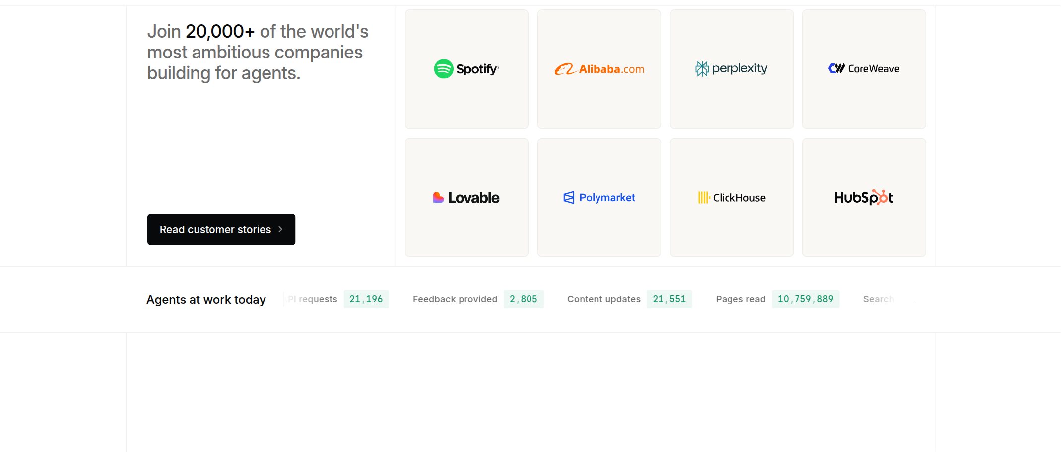
### [BENTO] Editorial Feature Showcase Split — *(mintlify.com)*
- **Source Reference:** https://mintlify.com/ · **Craft Score:** 97/100
- **Layout Mechanics:** BLOCK container (1425×608px, padding 0px 0px) using centered single-rail composition on a crisp editorial light #ffffff canvas.
- **Computed Tokens:** `mode: light` · `bg: #ffffff` · `ink: #141413` · `font: inter (24px, tracking -0.24px)`
- **Tactile Micro-Details:**
  - Display typography set in inter at 24px (tracking -0.24px) paired with #141413 primary ink.
  - Zero-clutter structural framing with 4px radii and subtle #f1f0ee hairlines.
  - GPU-friendly motion choreography (6 live WAAPI timelines, primary easing cubic-bezier(0.22, 1, 0.36, 1)).
- **Agent Recreation Directive:** Build a Editorial Feature Showcase Split inspired by mintlify.com's bento-features architecture: use a block wrapper (max-width 1425px, padding 0px 0px, gap normal) on background #ffffff with #141413 ink. Set the primary heading in inter (24px, letter-spacing -0.24px), preserve the exact semantic DOM hierarchy from the Clean DOM Blueprint, and reserve #141413 strictly for the primary focal action.

```html
<!-- Clean Semantic DOM Blueprint (mintlify.com · bento-features) -->
<section>
  <div data-layout="grid cols-24 gap-normal">
    <div data-layout="flex">
      <div data-layout="flex column gap-40px">
        <h2 data-type="inter 24px/-0.24px">Join of the world's most ambitious companies building for agents.</h2>
        <a data-layout="flex gap-4px" data-cta="ghost r:4px">Read customer stories</a>
      </div>
    </div>
  </div>
    <div data-layout="grid cols-24 gap-normal">
      <div data-layout="flex gap-24px">
        <span>Agents at work today</span>
      </div>
    </div>
</section>
```

### [PRICING] Structured Usage & Plan Comparison Grid — *(resiz.es)*
- **Source Reference:** https://resiz.es/pricing · **Craft Score:** 94/100
- **Layout Mechanics:** BLOCK container (900×607px, padding 180px 0px) using centered single-rail composition on a deep low-glare dark #212121 canvas.
- **Computed Tokens:** `mode: dark` · `bg: #212121` · `ink: #f5f7f3` · `font: Switzer (64px, tracking -2.56px)`
- **Tactile Micro-Details:**
  - Display typography set in Switzer at 64px (tracking -2.56px) paired with #f5f7f3 primary ink.
  - Zero-clutter structural framing with 12px radii and subtle #f5f7f3 hairlines.
  - Restraint-first static precision with instant hover feedback and zero distracting scroll-jacking.
- **Agent Recreation Directive:** Build a Structured Usage & Plan Comparison Grid inspired by resiz.es's pricing architecture: use a block wrapper (max-width 900px, padding 180px 0px, gap normal) on background #212121 with #f5f7f3 ink. Set the primary heading in Switzer (64px, letter-spacing -2.56px), preserve the exact semantic DOM hierarchy from the Clean DOM Blueprint, and reserve #f5f7f3 strictly for the primary focal action.

```html
<!-- Clean Semantic DOM Blueprint (resiz.es · pricing) -->
<section>
  <p>Our products</p>
  <h1 data-type="Switzer 64px/-2.56px">
    Different tools.
    <em>One ambition.</em>
  </h1>
  <p>Infrastructure you can talk to, a platform that lives in your cloud, and AI workers the re</p>
</section>
```